Depending upon your specific situation, and what you want the graph to communicate, another candidate strategy might be to focus on the maverick point(s) allowing the axes to remain in tact for the majority of the points. Please see the two examples below. This idea originally suggested to me (personal communication) by John Tukey (JWT).
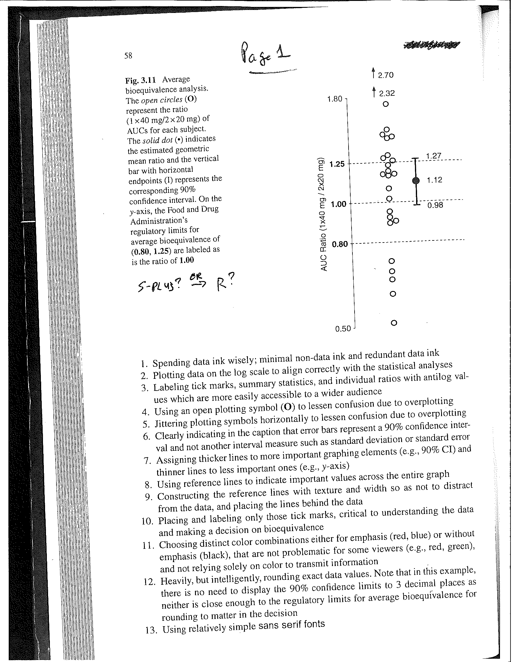
Example 1 (Pages 1 and 2): Univariate. The "up arrows" indicate that there are some "way out" / "far out" values of sizes 2.32 and 2.70, while allowing all the other points to be clearly visible. Constructed in either S-PLUS or R, I believe.
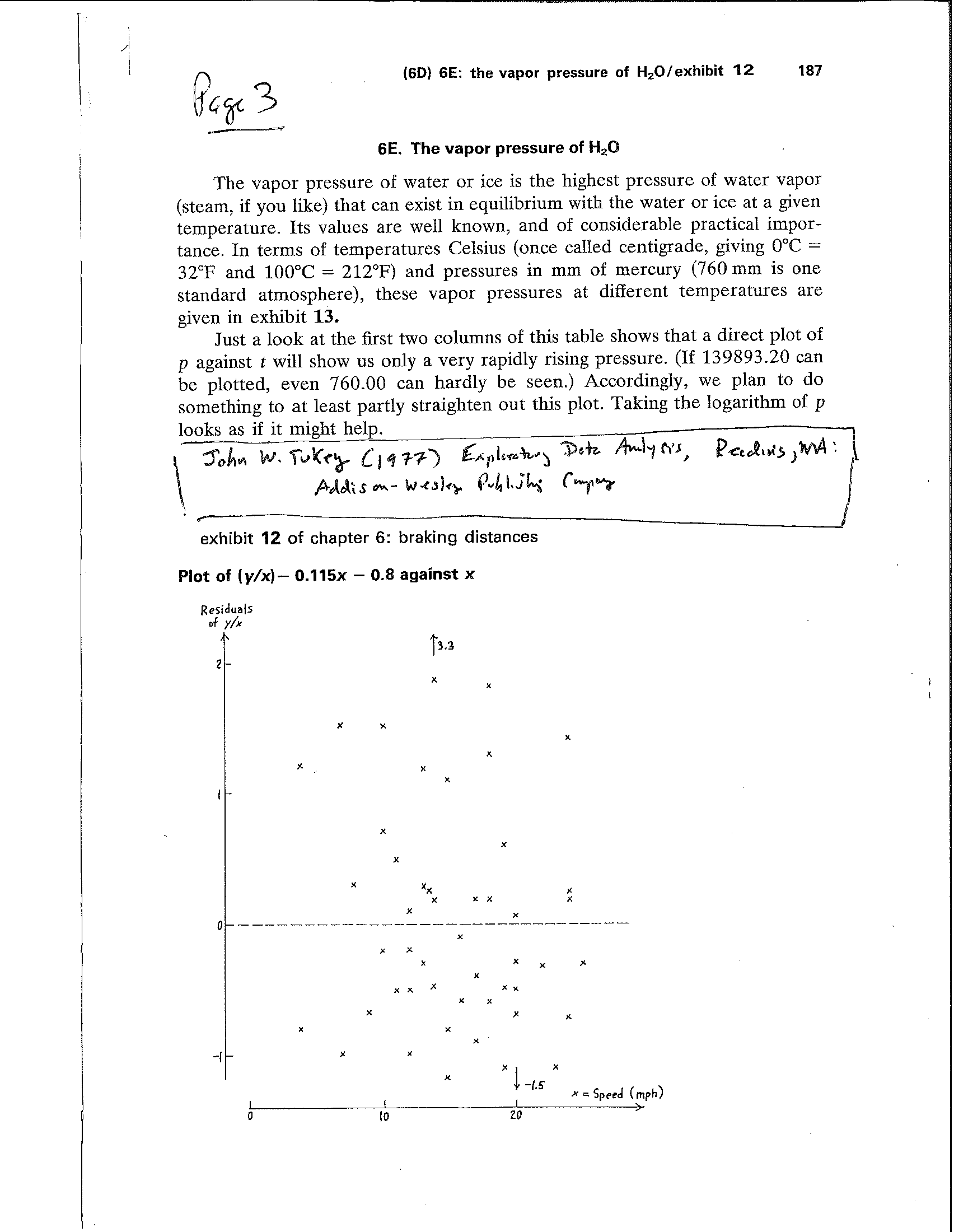
Example 2 (Page 3): Same idea extended to 2 dimensions. The "up arrow" and "down arrow" indicate points far away from the others, but still allows clarity of the scatter plot. The arrows are placed at the x-value for each point. This plot hand drawn by JWT (?) in his EDA Book.
To reference the original idea: Tukey, JW (1977). Exploratory Data Analysis, Reading, MA: Addison-Wesley Publishing Company.
Example 2 is from page 187 in his book, but JWT provides additional guidance on other uses of the arrows, as well as other simple glyphs or notations to communicate quantitative / qualitative information effectively and efficiently.
------------------------------
Thomas Bradstreet
Director, Preclinical Imaging, Biomarkers, and Discovery Biostatistics
Bristol-Myers Squibb
------------------------------
Original Message:
Sent: 06-06-2022 15:17
From: Russ Conte
Subject: Creating a Graphical Display with x-axis "broken"
One possible solution - Virtually all graphics programs can plot 2 y-axes on the same graph, apparently including Stata. While that is not exactly what you are asking for, it does compare the data on two different scales in a way the reader will understand. I use R and Excel and both do that very well. A link I found for doing this with Stata is:
https://www.statalist.org/forums/forum/general-stata-discussion/general/1459606-two-y-axes-plot
------------------------------
Russ Conte
------------------------------
Original Message:
Sent: 06-06-2022 01:10
From: Eric Siegel
Subject: Creating a Graphical Display with x-axis "broken"
It appears that, although Stata's graphics commands do not allow for broken axes, they do allow one to cheat.
https://www.stata.com/support/faqs/graphics/scale-breaks/
------------------------------
Eric Siegel, MS
Biostatistics Project Manager
Department of Biostatistics
Univ. Arkansas Medical Sciences